iPhone

3 Apps All Agilists Should Have on Their iPhones

So your company has decided you're going to use Agile on your next project or product, they need someone to lead the pilot team, and you've been nominated for the job. It's time to really step up your game. Time to set your iPhone settings to Agilist. Here are three apps you should download to help you get there. I've been using the LeanKit and Pomodoro for several years now and they just get better and better. I'd do a write up for Android phones but I've never seen a list that didn't have a little controversy.  

1. LeanKit

leankit

LeanKit supports the implementation of Lean principles, practices, and work methodologies across all business functions, to help organizations create an environment of continuous improvement and innovation to deliver customer value, faster. By visualizing your work as it flows through your process, LeanKit provides a big-picture understanding of the work that helps teams work together more effectively.  I've been using LeanKit for years for both private (Personal Kanban) applications and professional (portfolio management, help desk,...)

2. Pomodoro

pomodoro-pro

Pomodoro Time is a powerful personal productivity tool incorporating the principles of the Pomodoro Technique. Create tasks, configure breaks and track your progress throughout the day, week or custom period. I set the timer for 25 minutes. After the 25 minutes, and I set the timer to take a 5 minute break. I can guarantee I'm more productive by taking two 5 minute breaks each hour. Combined, LeanKit and Pomodoro are my one-two punch to keep ADD in check and my day moving forward.

3. Slack

slack

Over the years, I've used a lot of IM and persistant message tools. Hands down, Slack offers the lowest friction of use. All your team communication in one place, instantly searchable, available wherever you go. That's Slack. - It's real time messaging, file sharing, supporting one-to-one and group conversations - Powerful search and archiving, meaning no one is ever left out of the loop.

How to Add cards to a Kanban Board With Your Voice

I'm a fan of LeanKit, Personal Kanban, and Lifehacker.  So, what about adding cards to a Personal Kanban with no hands?

My LeanKit Personal Kanban

It's an awesome tool. It allows me to visualize and control my work, through a web page or any of my Apple devices.  It doesn't matter if I'm at home or work, I'm just trying to get stuff done and know what I need to do next.  Unfortunately, I'm not always at home or work.  I'm on the road.  I commute 1.5 to 2 hours (each way) to be with my client every day.  What can I say, I feel I can help my client a lot more if I'm looking them in the eye or doing a gemba walk.

My Commute

I seemingly have my best ideas while I'm on the road.  Though my Personal Kanban board pretty much looks the same, regardless if it's on my wall, Macbook or on my iPhone, you don't want me writing on post-its or typing in data while driving.  You think texting and driving is dangerous?  Try adding cards to a Kanban board!

My Lifehack

Rather than having to decide between being a danger to society and adding cards to a Kanban board, you're about to learn how to add cards to a LeanKit Kanban board with only the sound of your voice.  It's as easy as voice dictation on the iPhone.

Step 1

On your Personal (LeanKit) Kanban board, locate the default drop lane. There is a little "Add a new card" icon at the top of the lane. Click it and you'll see the e-mail address to email cards to.

On your Personal (LeanKit) Kanban board, locate the default drop lane

Step 2

Create a contact for your Personal Kanban (or name of your board) in the address book on your phone.  Add the email address from the default drop lane.

Create a contact for your Personal Kanban (or name of your board) in the address book on your phone

Step 3

  • Using Siri, just say send email.

  • Say the title of your board. Personal Kanban

  • Say the title of the card. Testing

  • Say the content of the card. This is a test of the voice to add card feature

With Siri, just say send email

Step 4

Upon arriving at home or work, all of the new cards are waiting for you.  For me, all I need to do is remove my iPhone signature and I'm ready to go!

Upon arriving at home or work, all of the new cards waiting for you

Conclusion

This little lifehack will save me hours a week in pain and anguish, trying to remember all of the awesome ideas I have while on my commute.  Do you have any LeanKit shortcuts you would like to share?  Maybe you want to share a lifehack?  I'm on a quest to eliminate as much waste from my life as reasonably possible. Help me out!

LeanKit Kanban

LeanKit Kanban

When the Agile Manifesto for Agile Software Development was written 10 years ago, it stated "We are uncovering better ways of developing software by doing it and helping others do it." The very first of four values listed within the Manifesto was "Individuals and interactions over processes and tools"

The Manifesto goes on to state "...while there is value in the items on the right, we value the items on the left more."

Well, I am compelled to write about one of the items on the right.  I still believe the tool should be good enough that it helps you reach your goals.  But after that, it should not become a big process onto itself.  What I want to do is finish tasks and get some actual closure on them.

I recently read in the book Personal Kanban by Jim Benson and Tonianne DeMaria Barry, a phenomenon known as the "Zeigarnik Effect".  It states that 90% of people remember uncompleted or interrupted tasks better than completed tasks.  Soviet psychologist Bluma Zeigarnic found that the human brain becomes preoccupied with things that are not closed.

Though I have leveraged Kanban with teams, it took me a while to realize that Visual Control Systems could be used to visualize and manage both personal and professional work.  I then found myself using a physical board at the office and an electronic version (web-based tool) at home.

What is visual control, exactly?

A visual control is a technique employed in many places where information is communicated by using visual signals instead of texts or other written instructions. The design is deliberate in allowing quick recognition of the information being communicated, in order to increase efficiency and clarity.

The real question is, can a process tool take the place of individuals and interactions?  Perhaps we need to stop and think about the reality of our world.  Is everyone in your company physically located in the same office space or are you geographically dispersed?  If you're not all sitting there together in an open workspace, you need to find a tool that will bridge that physical gap and then stay out of the way. Bandit Software's  LeanKit Kanban does that.  Let me tell you what puts LeanKit in the lead of the Kanban tool race.  It's called mobile computing.

leankit_ipad

I seem to carry my iPad with me everywhere. (I'll be getting an iPhone as soon as my contract is up).  Though the LeanKit iPhone/iPod interface could use a little work, the iPad interface is completely awesome.  The image above is actually a screen print from my iPad.  The design is simple; it's lightweight; it's functional.  It helps me visualize my work and it helps control my work in process.  Merge LeanKit Kanban and an iPad and you will have an amazing user experience, as it allows individuals to interact wherever they see fit.  I'm happy because I can access half a dozen different boards with tap of my finger and my wife is happy because I didn't cover the walls of my home office with whiteboards and sticky notes.

If you're thinking about using a web-based Kanban tool for yourself, your team, or your organization, all of the vendors out there have relatively similar features.  See which one fits your budget.  If you or your teams are using mobile devices like iPhones, iPods, or iPads (in addition to desktops or laptops), you need to go to iTunes and download this app.  Though you need to have an existing LeanKit account to make the Apple App versions work, you can get a personal account for free!

After you see how well it works for your personal life, I don't doubt you'll be using it in the office in the not-too-distant future.

HT: Wikipedia HT: LeanKit HT: Personal Kanban

Follow-up review of the iStudy v2.0 PMP application

The iStudy PMP v2.0 is an iPhone and iPod Touch application specifically designed to help those aspiring to pass the PMP® Exam. When I did my Original Review of the iStudy PMP® application, I was pretty happy with it.  I said for $10, go for it.  One feature I really liked was the questions were completely random.  So, each test was unique.

So, how does v2.0 compare to v1.0?

Here is what changed between the two versions:

- Key summary for each question as well as page references to the PMBOK
- The initial number of questions has been increased from 20 to 35.  All 35 questions are new and were not available in the previous version.
- Improvements to the UI (better responses; works in both landscape and portrait)
- Users can now purchase an additional 550 questions from within the application.  This version leverages a freemium model.  The free version is ad supported.  If users wish to upgrade, they get an additional 550 questions for $2.99.  (Purchase from within the app).  If you’re interested in this app, you can get it from the iTunes store or go to www.istudyapps.com.

Do I think you should get it?  Again, I say go for it! It's only $2.99 for 550 questions and this version is even better than the last.

Disclaimer: Though I recommend this product, I am not financially benefiting from this review.

What happens when you walk your own critical path

PMP Exam Flash Card

Last night we deployed HueCubed v1.0 to Production.  A year ago, I had an idea for a product that would inexpensively help people study for the PMP® Exam and other certifications or tests.  The result?  HueCubed. HueCubed is a web application which will display randomized flash cards.  Upon reviewing the question, you simply click on the Flip button.  The card flips and displays the answer.  You then have several buttons you can click.  If you click on skip, incorrect, or correct, the system will log your selection.  You can then, at any time, click on Check Progress.  If you click on Flip, the card flips to the other side.  If you click Back, you will navigate to the previous card.

Progress

So let's say you want to see your progress and click Check Progress.  Your choices will be broken down by categories of study.  Think of them as mini decks of cards.  There is one big deck (All) and then you have it broken down into 23 categories.  At any time, you can click one of the squares and it will return you to that card for review.  e.g. if there were 28 cards in a deck and you click on 14, you can go directly to card 14 of 28. (see image)

Anyway, I can go on an on about this product.  The idea came to me after I was asked over and over again to recommend products to help people study for the PMP® Exam.  Sure, the products are out there.  But, each one had something I didn't like or thought could be improved upon.  I wanted something Simple, Powerful, and Cost-Effective.  So, I created HueCubed.

The last year has been hard.  I went through 3 development teams before I got a winner.  I'm not demanding or anything.  It's just hard to find the right team sometimes.  I spent countless hours eating my own dogfood.  I created UI wireframes, I created fnctional designs.  I created a WBS.  I used a Kanban to manage my work.  We iterated and iterated.

HueCubed v1.0 was my critical path.  All of the required deliverables are there.  It will be a solid platform to build upon.  I hope I didn't drive me wife too crazy with the idea of this first product.  I still have a group of offerings I want to provide.

In closing, I want to quote 2 great people who inspired me to do what I did.

Jason Calacanis said “Starting is easy; Finishing is hard.”

Seth Godin wrote "Pick a budget. Pick a ship date. Honor both. Don't ignore either. No slippage, no overruns."

I had an idea on March 22, 2009, that seemed simple enough to finish.  How hard could it be?  The answer was "very".

I had a budget and stuck with it.  I gave myself 1 year to get it done or move on with my life.

I bootstrapped the effort and got it delivered.

HueCubed v1.0 went live at 11:28PM last night. Yep, March 22, 2010.

Review of the iStudy PMP App for iPhone and iPod Touch

Disclaimer: Though I recommend this product, I am not financially benefiting from this review.

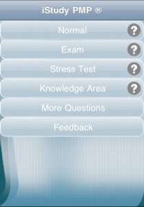
main page

Questions and Answers

The iStudy PMP is an iPhone and iPod Touch application specifically designed to help those aspiring to pass the PMP® Exam.

If you have seen sample questions from the PMP exam, you know the pain points; double-negatives, lengthy questions, what is the "best" answer...  When I prepared for the PMP Exam a few years ago, I spent several hundred dollars for a program that simulated the PMP exam.  I'll admit, it worked great!  But, what if I could have passed the exam and also saved several hundred dollars?  If this application was around when I was preparing to sit for the exam, I would have purchased it first.

Interface

iStudy PMP contains 200 questions that intend to replicate the PMP exam. The interface is clean and it allows the user to concentrate on answering the questions.  If you come to a question you're not sure about, you can Mark (skip) it.  I thought I ran into some problems with the Mark feature.  Swiping my finger across the screen didn't always advance me to the next card.  After some practice, I realized it was just me. The application was working just fine.

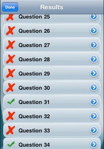
Not to get ahead of myself, but there is a results page to see correct/incorrect results.  One thing missing is a similar navigation page showing the skipped questions.  You're given the opportunity to go though the skipped questions at the end of the exam but you can't see how many skipped you have.  You just have to go through them one by one.  I contacted the creator of the application and he confirmed this is something to be resolved in a future update.

Tests

iStudy PMP has 4 different modes designed to cater to different learning styles.

Normal - This mode displays all 200 (randomized) questions and allows you to sequentially browse. You can go back and forth as many times as you wish, but you have to go in sequential order.

Exam - This mode is similar to the Normal mode minus the fact you have a time limit of 4 hours to answer all of the questions. You can go back and forth between questions as many times as you need to change answers.  If after 4 hours you have not answered all of the questions, the exam will automatically end and your results calculated.  This is good because if there was one thing I took away from doing full length practice exams, they help you build up your stamina.

Stress Test - This is a pretty interesting mode. I like that you choose the number of questions you want to answer (out of 200) and an amount of time you wish to allow yourself.  If you fail to answer a question before the timer hits zero then that question is marked as incorrect and the application advances you to the next question.  Let's say you set the stress test to 15 questions and 2 minutes per question.  Your stress test will be done in 30 minutes.  Pretty cool.

Knowledge Area - The PMP Exam assesses your competency from 9 Knowledge Areas. This mode is like the normal mode but it allows you choose a specific knowledge area.  This is a nice feature when you know you have specific knowledge weaknesses.

Results Screen

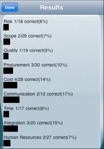
Once you have completed a test, or if you intentionally end it, you will be presented with the Results screen. Here you will see whether or not you passed the practice exam. Results will be broken down by knowledge area so you can see where you need to improve.  All questions will be listed as either correct and incorrect with an option to display the entire question and answers.

Summary

For $10, I say go for it!  One feature I really like is the questions appear completely random.  So, each test should be unique.  If you're interested in this app, you can get it from the iTunes store, go to www.istudyapps.com or click here.

The Lights are on at HueCubed

In anticipation of my upcoming iPhone application release, I figured it was time to stand up a new website with the purpose of distributing my own brand of tools, templates, and talk.  The Critical Path will remain as my blog.  But, selling products requires branding.  By following me on Twitter or reading this blog, I think people will enjoy the HueCubed brand.

Creating an iPhone Application and Project Management

Before you begin designing and creating the next greatest iPhone application, it’s critical to define exactly what you plan your application to do, so says the iPhone Human Interface Guidelines.  A great way to do this is to write a product definition statement.  It is a succinct affirmation of your application’s core purpose and its intended audience.  I believe Apple understands, in order to be successful, you have to have a plan.  Developers of iPhone applications are not necessarily project managers.  Perhaps Apple is giving them better odds of success, by encouraging them to write a project definition statement.  I once worked with a very knowledgeable developer, Kent Lynch, who spoke out during a managers meeting saying, "People don't plan to fail; they just fail to plan".  He could not have been more right. A project mission statement is no different.  No project should be attempted without first capturing a mission statement.  Traditionally, mission statements contain:

  • Project Name
  • Description
  • Purpose
  • Primary stakeholders
  • Responsibilities towards these stakeholders
  • Products and services offered

If you can articulate a mission statement that satisfies these few bullets, you're on you way to understanding what you need to do to have a successful project.

(Image by jaapoost on flickr)